E-GUI
Designing User
Interfaces
Overview
Why are some programs easy to use and others just plain frustrating? An overview of principles involved in good user interface design and a review of some of the better (and worse) implementations drawn from examples in Visual FoxPro, Windows and Microsoft Office. Includes a checklist of good principles to follow and some tests to run to verify you have created a good design. Discussion will focus on the "right" user interface design for VFP applications.
Introduction
What’s a User Interface?
Who Cares?
Why Bother?
Goals
Give you questions, not answers
Discuss UI Principles / Standards
Identify common UI mistakes
Expose hotly debated issues
UI Principles
Clarity
Invisibility
Guidance
Speed
UI Standards
CUA / OSF / X / OS/2-PM
Windows (NT) 3.1
Windows 95
Windows 95 Drill-down
Thinner fonts
WhatsThis? Help
Context (rightclick) menus
Conceptual Issues
Sovereign vs. Transient Applications
 Sovereign applications: full screen, tools
at hand, no nonsense. Note gadgets on every window frame, multiple toolbars,
dense menu
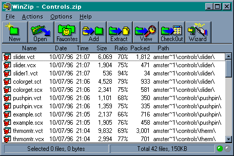
Transient application: Simpler frame, almost clownish buttons, simple menu
Implementation Model vs. Physical Model
Documents vs. Dialogs
UI Mistakes
Highlights - two are not always better than one
Button labels
Improper controls
Poorly designed graphics
Hot Topics
Input: proportional or ugly?
Modal or Non-Modal? (MDI/SDI)
Standard or Interesting?
Summary
UIs should invisibly help users do their job
Make it clear, explain it, help, don’t hinder
Where to get more information
Bibliography
Professional Associations
Consulting services
Illustrations
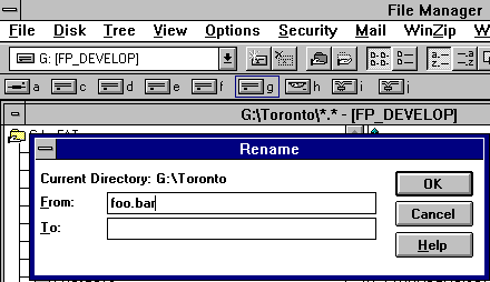
The File Manager's Rename Dialog - why two
text boxes?
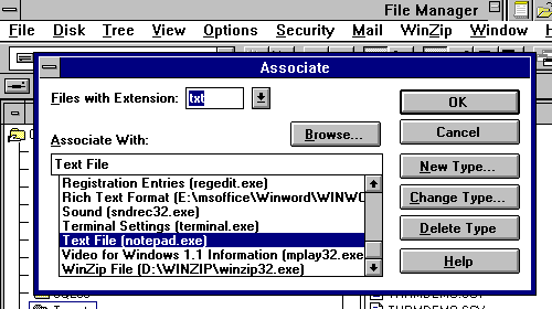
Another FileMan gaff: where is the
highlight?
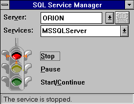
Click on the light once, and the control
gets focus, twice to activate it.
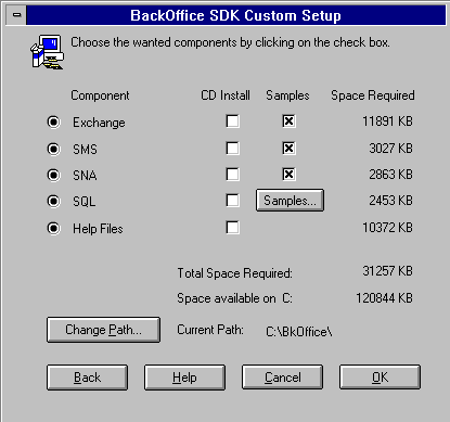
Who pushed all the buttons in? And how do
you get them to come out!!!???

Make toolbar buttons distinctive, not descriptive.

Word does a much better job, with distinct
color, images and white space

But completely blows it with the File/Open
All-In-One File Management, network snooping,
Boolean search-building, dialog-and-toolbar(complete with drop-down menu) complex here.
Bibliography
Here are a few books I think are worth reviewing, browsing or studying.
Cooper, Alan, About Face: The Essentials of User Interface Design, 1995, IDG Books, ISBN 1-56884-322-4. My favorite book of 1995. Outrageous and astute, a sharp review of what's good and what's dumb about user interface design. Covers both Windows 3.x and the new Win95 shell. Very pleasant reading.
Granor, Tamar and Ted Roche, Hackers Guide to Visual FoxPro 3.0, 1995, Addison-Wesley, ISBN
0-201-48379-3. As well as being my favorite 3.x book to date, this book has
some good (and points out some very bad) examples of user interface design,
especially in the MessageBox() section. A good overall reference for
intermediate to advanced Visual FoxPro users.
Laurel, Brenda, ed., The Art of Human-Computer Interface Design, 1990, Addison-Wesley, ISBN 0-201-51797-3. An excellent and thought provoking collection of essays from nearly everyone else on this list as well as Jean-Louis Gassée, Timothy Leary, Nicolas Negroponte and many others.
Microsoft, The WindowsÒ Interface Guidelines for Software Design, Microsoft Press, 1995, ISBN 1-55615-679-0. The explicit description of how Microsoft intended their interface to work, updated to cover Windows 95 and NTÔ. While the actual implementation of their applications, and therefore yours, sometimes differ from the standard, this is an excellent starting point for discussions on "How should I represent…"
Norman, Donald, The Design of Everyday Things, Doubleday, 1988, ISBN 0-385-26774-6. This book was originally published as The Psychology of Everyday Things, and thus became an excellent example of user interfaces (in this case, the title) and people's reactions to it. It was a flop, until it was renamed to its present title, thereupon becoming a best-seller. While little is devoted to computers specifically, the examples illustrate why devices work for people - or don't.
Parker, Roger, Looking Good In Print, Ventana Press, 1988, ISBN 0-940087-05-7. Not at all about video user interfaces, this book focuses on the paper user interface of the printed word. An excellent overview of what and why fonts are, how a person perceives and digests a page, and ideas for better layout. While focused on the desktop publishing industry, this book covers many principles which come into play when we design a screen.
Shneiderman, Ben, Designing the User Interface, Addison-Wesley, 1987, ISBN 0-201-16505-8. One of the original texts in the field, still very applicable in theory even if somewhat dated in terms of examples.
Tognazzini, Bruce, TOG on Interface, Addison-Wesley, 1992, ISBN 0-201-60842-1. Formerly the User Interface Evangelist at Apple Computer, Tognazzini's engaging style make this book a pleasure to read.
Tufte, Edward, The Visual Display of Quantitative Information, 1983 and Envisioning Information, 1990, both from Graphics Press. Great coffee-table picture books, these two texts provide some ideas (and excellent samples) of how and why and how powerfully the proper use of graphics can convey information.